Friday, July 23, 2010

Template Websites Revisited: The Portfolio

Templates have their place in website design. It can make things easier and much less complicated for the designer. The code is all right there and if anything, only minor adjustments will need to be made. You can have a much quicker turnaround on site if you use templates and you can afford to price your sites cheaper. However, is it cheating to leave the site exactly how it is designed and only add content? Depending on the client and depending on how well you think the existing design works for the client, no. On the other hand, we are designers as a career and lifestyle choice. How does your conscience feel about this decision? Personally, mine feels like crap. I can see that template sites have their uses, and while I can work with them fine, I don't feel they have a place in my life. Namely, I don't feel I should use one for my portfolio site.

My portfolio site represents me as a designer, as a creative, and as a person who is both creative and logical. My logic says a template portfolio site doesn't show your creativity to either problem solve or present yourself uniquely. My creativity says a template portfolio site puts you in a square box that's super glued shut that you have to design your way out of...in a week (the due date of my portfolio site for class) when you already have a 55-60 hour work week. While using a template for my portfolio site would make it "easier" in that I would have places to quickly drop my pieces into, it also means I have to find exactly the right template to do that. Now, I don't like to be pigeonholed, as I'm sure most creatives do not. How many perfect portfolio site templates are out there that can represent me as a designer, uniquely? If you guessed the answer was one, you're right. Now how do I find that one? I have no idea. It needs to be free because I'm not going to pay money for something I'm not going to use when I'm a college student with no income. It needs to show my personality because that's one of the things prospective employers look for in a portfolio site of someone they're looking to hire. I read in an article that I have previously mentioned in another post that employers first look at the website design. If it's total crap or uninteresting, it's over. If it's at least tolerable to good or excellent, they look at the work.

Where does this leave me?

Tuesday, July 20, 2010

Qualities of Portfolio Sites


I love this site and I keep coming back to it. As soon as I get to the site, I start to get a feel for the kind of person Alex is and what kind of work he does. Even though the navigation is not openly labeled, it's easy enough to figure out that you probably need to click on something. When you hover over something and it responds, you know it's a link. The responses are clear, so it's not hard. For example, if you hover on the door to the table, the door opens and you are left hovering over an iPad that says "Portfolio." The work is displayed on an iPad with a project lis ton the left. This is fantastic in the way that it utilizes technology! It not only shows that Alex knows about the iPad and can use it to display his work, but that he can design specifically for it as well. The only really bad things about this site is that the work can't be zoomed in upon (and the work is pretty small considering) and that there is an annoying autoscroll feature so every time you move your mouse, the page moves. You can, however, turn this feature off. I believe the site is made using javascript, though originally I thought Flash. It's weird that there's no text (though if you go to view, source, there is a lot of behind the scenes information that is rather interesting, including his concept for the site). It's about this time, when you are wondering where the text is that you see the ab in the top left and decide to hover or click on it to see if it does anything since it's at the top. After dragging it out, it is apparent that the links are there! Clicking on the "About Me" section results in finally finding text! I have to admit, the minimal text does leave you to focus on the work and his skills as a web designer. However, it also leaves you to wonder about a lot of his projects because of the lack of background coupled with the small imagery. While I like the way his photo section is laid out, having to close the pop-up window really is a pain. I want to look around and see how different designers solve the problem of enlarging their work and having to close windows to get back to the main gallery.


What grabbed me about this website was several things. The colorful yet not overdone bubbles (that fit with his logo) are cheery and modern ways of creating links that are easy enough to navigate, but different than average. The background picture is kind of muted and because the sky is blurred out (even though it's to focus more on the site content), it makes the site kind of depressing in a way. I really like how Alex's portfolio is displayed. This is one way of solving the problem the last site had. Even though the work samples are smaller, they are large views of small parts of the whole of the design. Different views are featured by simply clicking through the arrows for each piece of work. If you wish to have a view of the work on a larger scale, you just need to click on "view website" and it will launch in a new window. However, you can see enough details that it isn't necessary to make the extra window pop up unless you're extremely interested or curious because you get a really good idea of the project from the main work gallery itself. I also like the way he words his portfolio and the casual yet knowledgeable tone he takes. I like that there is a +1 to show that he has added a new piece to his portfolio. Faults of this site include the casual and not grammatically correct text. Some of this might be because of the language difference, but I don't think all of it is.


There are some aspects of this site I really like, and others I do not, which makes it come out kind of middle-of-the-road, but I thought it was worth reviewing. Because of the varying backgrounds, the text, links, and even the logo are hard to read or impossible to read at times! However, the large pictures of their work are fantastic. If you click on overview, the page is full of thumbnails and the work is broken down by category (again, difficult to read). It's kind of weird that the search bar floats to end wherever the line of thumbnails ends on a given page because it makes it seem somewhat out of place at times. I like that if you hover over an image, it gives a brief summary of the contents of the project so you know that when the picture enlarges if you will have to look for a way to look at the other pictures in the series or not. It took me awhile to realize that there were invisible-until-hovered-over shapes in the form of a minus and a plus to go forward or backward within the gallery. One of the things I like most about this site are that the links are up near the side and corner where you might expect them and it is almost reminiscent of a blog format because of that. The obvious strength of this site is how well they exhibit their imagery. I also like how the description of the piece is in the bottom corner so that it doesn't interfere with the image, but it is still there for reference. I think the relationships are formed very well within this site.


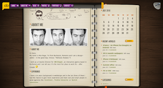
I wouldn't mind my personal portfolio site having a lot of the qualities that are found on this portfolio site. From the home page, the site exemplifies a "crafty" nature that reminds one of scrapbooking. The notebook is nice and clean and serves as a great "window" to house the site's information. It's big enough and the portfolio pictures are done in such a way (variety of shots including close-ups) that you're not left feeling like you can't see the work or it's too small. Because the designer does a few different kinds of designs, she has broken it up into categories on the side. The layout of the site is very clean and feminine and every little detail of it fits together quite well. There is no hassle of new windows opening up for the portfolio pieces either, which is nice, and most have more than one page. The home page in itself is very striking and has a cozy, feminine feel to it while maintaining a clean, striking, and organized structure.


I think this is a great example of a portfolio website for someone who is trying to figure out what to put on theirs. The design is clean, crisp and professional with a slight flare of personality. Instead of the generic link headings, they focus on the 4 "W" questions and including "we" in the link heading (like who we are, etc). The writing is both professional and humorous. You get the feeling that everyone who works at this agency is friends. On every page there's a button that says "Hire Us. You won't be disappointed. Seriously." This could be taken as pushy, but honestly, coupled with every other aspect of the site, I think it's just honest and confident. On the "What we do" page, it gives a great in-depth description of the services OnWired offers and explains it in a way that makes the client feel more confident and understand a bit about what they're getting into. Another great feature is the little personable note that says "How much will it cost? We get this question a lot. Our short answer? It depends. Keep reading to find out why." I think this is a great approach for a larger agency to take to pricing without causing suspicion or controversy. On their "Where we've done it" page, they actually show their process! The final design comes up by default in a photo frame, but you can hover over sketch and wireframe, and even in some cases, the original and they will come up in the same photo frame. At the corner of the frame, there is a place to click to see the live site. With each piece, there is a short description of the project and a quote from the client. The heading on the portfolio page even says "Our work. We hope you enjoy it..." OnWired strives to be both your professional designer and your fun older brother (full of wisdom and looking out for you in a kind way). I think it's a great approach to selling design services and it's one I hope to be able to replicate in my own way with my own style.

Content for Portfolio Websites

An online portfolio allows you to show your skills and qualities to a possible employer. Because of this, your portfolio should include necessary work samples and process samples that will allow potential employers to evaluate if you would be a good fit for their company. Your site must speak for you before you are even interviewed. It's also important that your portfolio is relevant and professional and that there are absolutely no grammar or spelling mistakes. Everything mentioned on your resume should have a place in your portfolio because otherwise it is left unrepresented. You can include examples of your "soft skills" and qualities to not only mention, but demonstrate your abilities to do what everyone says they can do: communicate, work in a group, work hard, etc.). Because we are graphic designers, creativity is a major portion of our portfolio as well, but it needs not be to the point of clutter and slow or unruly navigation. I read in this article that it is good to keep font choices and color choices to no more than three. Your portfolio should represent you and showcase your abilities; it should show who you are, what you do and how you think. Your portfolio should be able to stand alone, without a need for your explanation about anything.

Your portfolio should have either the focus of getting hired or the focus of obtaining clients. Before designing your portfolio, if you are aiming to get hired, you should try to get inside prospective boss' head and design for him or her. They have undoubtedly looked through many, many portfolios and will be hoping that yours stands out. So make it stand out! In this article, it mentions that the first thing one employer does is critique your portfolio site. Upon passing that inspection, the work is looked at. Only if the work is good, will the employer visit the about page or blog or any other pages you have included. This article also says that "a potential employer will probably make up their mind within the first half-dozen pieces you show - if you've got the goods, get them to the front of the portfolio so they act as a hook. Certainly when I look through portfolios, if I didn't see what I liked early on I wouldn't bother going much further. And if I did go further and unearthed better work buried deep in the site, I'd inevitably wonder why it wasn't shown early on, leaving questions about the candidate's understanding of their own work." This shows how important it is to get a second opinion about your work. Your portfolio is a very personal thing and chances are you've been working with the pieces for a long time. It never hurts to get a second, third, or fourth opinion as to how good your work is. Then you can take everyone's opinions or suggestions into mind and display what you feel is your best work first. I also don't think it's a good idea to show all of your good work (more than just your very best) on the front and leave only the near-rejects for the inside. Then the employer will doubt your ability to produce good work in quantity. Another tip besides getting right into your work is to explain your work. Answering the questions: "Who was the client? What was the brief? What problem was it solving? How did your work solve their needs?" will give the potential employer more of a feel as to where the project is coming from and a better understanding for you and your problem-solving process. Another tip is to make your portfolio "fast, accessible and simple. If you want to show your interactive creativity, it's best to do it IN the portfolio, not on it." There is an important balance between usability and showing your work creatively. It's important that you base your site off of intuitive concepts. Having large and detailed pictures of your work is extremely important as well.

If you are trying to promote a freelance business through your portfolio, you must consider what people you want as clients want to see in your site. Testimonials, client lists and good writing will do a lot to help you with potential customers. It's also important to explain your services and how your work for other clients has helped them. A good idea would be to include statistics as well to help persuade the prospective client that you are confident of being able to help them...whatever they need and you will produce good results for them. In a business portfolio, it's also not as important that you show all your work, so long as you show the best pieces. It's also important to have an easy contact link because prospective clients will obviously need to contact you.

It's also best to show work that fits with your prospective firm's work, though it would be beneficial to show that you are diverse as well. It's also good to use technology that you know that is also pertinent to the type(s) of design you do. Making a simple site and adding technologies to them is a great way to do this. According to this article, your portfolio should be limited to the best work you have for the target area of design in which you are interested. Conversely, "mixed bag portfolios" can demonstrate that you do several types of work and you do them well, thus it is easier to promote your work because you have more of it (though still try to keep the numbers low).

I think it is important to have a contact section, a portfolio section, and an about or profile section. Including blogs are also becoming popular. It's important to feature your logo (and tagline if you're looking for customers). Personally, I wouldn't want a one-page portfolio because it crams everything in one place and would have a really long page length. Even if you organized by categories going down the page, it would still hardly have the appearance of being organized. In addition, if you are diverse in your abilities, it makes it easier for your potential employer or client to find the specific type(s) of work about which they are curious.

Sunday, July 18, 2010

Personal Portfolio Website

My next project is to create a personal portfolio for myself as a designer. I will be using this site to provide information about myself and my design projects. Most of the projects will be from my classes and activities at La Roche, but there are a few exceptions. I've been spending a lot of time looking around at different online design portfolios and thinking about the qualities that I like and don't care for so I can get a better understanding of where to start my design. I've created an identity for myself within the past few weeks, and it is the SE picture on the page here. I just finished my business cards last week and I couldn't be more excited about them! They're so much more different than anything else I've created for myself. I have the best of intentions to make my portfolio site just as good and innovative. Hopefully enough people will see it and like it so that I might have a job opportunity when I graduate in the spring.

Use of Social Media for Small Clients

Small businesses and non-profit organizations can make use of social media in numerous ways to their benefit. I came across this article on my twitter feed the other day that is relevant. Social media is only mentioned at the bottom of this article because it's about the broad category of online marketing, but it says that "No organization can afford to ignore the growing importance of online social media channels such as Blogs, Facebook, and Twitter. You can expand the reach of your nonprofit if you can leverage these highly popular new social media in a creative and innovative manner." This article comes right out and says you should use social media tools because they're popular and because they're popular, if you're on them and use them to the best of your abilities, you'll get attention. As I've said before, to fully take advantage of the exposure social media can get you as a business or organization, you need to budget time to spend on it. You need to offer things that other people will see and interact with or things that will enrich a viewer's experience online. Links to things similar to your business or organization, offers or advertisements are things that you can post again and again and in different ways so that the news is never old. It's important to keep a fresh look to yourself on the social media so that people won't see you as boring or uninvolved or anything else negative. The point behind using social media is trying to get as many positive things out there about yourself as possible. However, in another article I read, it also seems kind of fishy if every item of feedback about your business or product is positive (especially as relates to an e-commerce site, but it has its place in blogs and other social medias too). Social media can also be seen as opportunities to correct "common" misconceptions about your company, organization, or product. Small businesses and non-profits can benefit from implementing social media on their sites by gaining new customers, gaining new supporters, acquiring financial donors, and correcting any misconceptions. To do this, they can advertise or post links of interest or events or specials using their social media. The more they say, the more they get out there.

You have to be careful to some extent, how you suggest social media. I think it depends heavily on the client. If it's a young or progressive client, chances are they'll know about social media, but they may or may not see it as a marketing opportunity. In that situation, you just have to show them how much social media can do for them. Perhaps one way of doing this is quoting some statistics of how social media works in action or showing some of their competitors (or even unrelated big names) using social media. If the client is unfamiliar or wary about social media, you'll obviously have to work harder. A good approach for this might be that it doesn't cost to advertise through social media, but it does to do whatever they're doing now. It would be good to point out how they could strengthen their marketing campaign all around to be more effective.

These types of clients may well feel overwhelmed about using social media. They may have no idea how to use it or how to use it for business instead of just pleasure. Social media will get them more exposure and free advertising, which is important to someone with a limited or nonexistent budget.

The Impact of Social Media on Pop Culture

Social Media is an explosive technology that has greatly influenced Pop Culture. I think because social media has so many different functions (little to no cost advertising, keeping in touch with people fast and efficiently, etc) it will absolutely become something bigger and better and more relied upon. I've run across several examples of the use of social media from places you might not have expected.

Kretchmar's Bakery, in my home town, created a fan page on Facebook and they use it religiously. Everybody in Beaver knows about Kretchmar's and it's fairly impossible not to, but Facebook helps people as far away as other countries remember fond times involving their beloved bakery from way back when. Recently, Kretchmar's has used their Facebook page to advertise different weekly specials during their 50th Anniversary sale. They don't put any signs in the window of the bakery and the only way to know about these sales are to be a fan on Facebook. Utilizing social media has been a great decision on the part of the bakery because they have spread their fan base, their customer base, and increased buying habits of their customers. I know that I, for one, have specially looked for their weekly sale announcements online and my family has made special trips down to buy things we would not ordinarily.

The Beaver Library has a Facebook page as well, which was quite unexpected due to the age of the people that work there. I became a fan, thinking they'd release titles of new books, and library events and programs. Unfortunately, the updates are few and far between and they either advertise events at the last minute or way too far ahead. Unlike Kretchmar's, they don't have many photos and make few posts. Beaver Library's idea behind utilizing social media was a smart one. Library demographics are traditionally older, more mature folks, but by being on Facebook, the library is trying to turn that around. They want to get more people involved with the library and more people to get excited about and utilize the library. Because Facebook's users are among a large age range, the library can generate interest in a very large group of people including teens, parents, middle-aged, and just generally forward-thinking patrons. This kind of exposure, if handled right (which, it needs improvement), could change the demographic of the library and transform it from a stodgy old-book smelling, low energy environment into a vibrant (yet still reserved) culture-enriching place. The large remodel they did a few years ago on their actual building was the beginning of this transformation. I feel that if they continue to utilize social media tools, they will be ahead in the long run.

Even the Pittsburgh Zoo is using social media to drive its supporters. They're offering specials like "like the zoo on Facebook and post a message to our wall, print it out and bring it and receive $5 off the price of admission." You have to do something and get involved with the zoo (or other organization or place of business) and you will receive something in return. Social media advertisements are a classic example of a call to action campaign and because any of the social medias are so easy to interact with, it's all the more effective in terms of ways to advertise.

Social medias are growing among the private population too. Twitter is often used to gather people quickly. That can be used for both good and bad, but it is a tool nonetheless. Twitter is especially useful for call to action campaigns as well because all it does is allow the user to post updates and spread it around the web (more so than Facebook because of privacy options, I believe). On Facebook, you can make "events" and invite friends. These can be degrees of public or private, even by invitation only. This makes it much easier to plan surprises and gatherings of varying sizes. Using Facebook for these attending these events is good because Facebook will remind you when the event is coming up too. Because of this social media technology, there is less paper waste and less of a grape vine effect (wrong messages). My cousin, a hater of technology and the internet, has a blogger blog set up for her 8 month old baby. This way, everybody in our family with internet access can go to the blog and check for updates when baby Avery does something new. Also, Allison doesn't have to have pictures printed, scan them in and email them and then we don't have to download the pictures because we can go back to them in cyberspace. Words cannot express how much better this is than email and besides, you can't lose track of it like an email: everything stays on the site and while you can become a blogger member to receive updates, you can also just go to the web address every week or so. In these ways, social medias (Facebook, Twitter, Flickr, Myspace, etc) help families and friends connect and stay updated about each other without having to interact much or spend a lot of time. You can also have a more broad friend base than you would have in real life because social groups don't really exist online as much and there's no rule about how often you have to talk to your online friends.

There are good and bad points with social medias, but I think the good far outweigh the bad. Because so many people are growing up in the age of computers, I think that more people are being exposed to social medias and seeing them as a way of life, a lifestyle. Computer technology in general has led to society evolving into a technology-driven world. The use of social medias will continue and increase in popularity because they are a catchy fad or trend of the computerized world and those things rarely go backwards.

Resources:

As this article says (http://chris.pirillo.com/social-media-in-education), I don't know why students don't use social media in the classroom! I think that if they did, they would learn quicker how useful it can be and not just see it as a way to "catch up with friends, chat about their day and play games." I think I fall into that category, actually. I have used social media tools for educational purposes, but I also use them for personal purposes like those mentioned. It's hard for me to make the transition of using them for personal purposes to using them for professional purposes. If there were a gateway, I think that would be a good thing. In some of the other articles I read where the 30-39 year olds and 60-69 year olds are making the most of social media tools, I believe it because they have been introduced to them as business tools, not necessarily social tools. I think using social medias in an educational setting is one solution for this.

The Social Marketing Blog (http://www.scottmonty.com) seemed a bit overwhelming when I first looked at it (just because of the amount of relevant information). I thought the toolbar at the bottom that coaxes you to share this page and update thus and such is somewhat obtrusive and annoying and by this point in my readings on social media, overwhelming. However, why wouldn't you want to share this blog? It's about social media marketing and hands you access to all your social media outlets at the bottom (in that way, it's smart). So what am I going to do? I used it! When I started reading the blog, I immediately grabbed the article titled "The 1.0 Homage." I saw it as sign that it's okay for me to really learn to use social media and it's okay for me to feel overwhelmed at the newfound complexity of my life and the 5 million things I now need to check daily. I can always take a short hiatus or simplify my life in other ways, but it's an important tool that's out there that I need to take advantage of. The "I See England, I See France" article was also interesting. From having done my research, I already knew the vast age range of people who took advantage of Facebook. This post shows that the largest group of users is 18-25, but also that 61% of Facebook's users are over the age of 25. This alone makes it a great social media marketing tool to take advantage of. The statistics from other countries were also interesting to look at in comparison to the U.S. statistics. As a female, the "Online Ad Targeting Is Pretty Much Like Dating" article was intriguing. I don't necessarily agree with all the points, but it was interesting to see a main consensus and the article was written in a refreshing and jovial tone. "Advertising to Gen Y on Social Networks" was informative because it had a list of ways to reach Gen Y on the social networks and kind of gave marketers a job.

Other informative links:

I'm thinking about acquiring a Flickr.

Designing for the Mobile Web

Designing for the Mobile Web is a good thing to be able to do because of the increasing number of people using the service. Steve Jobs even said there will soon be ads and interactive ads for iPod Touch and iPhone. He said you will be able to fully interact with the ads on top of any other open application(s) you may have and then easily return to doing what you were after you're done with the ad. I think this brings a whole new world to users as well as designers and programmers. That many more people will be seeing business ads too, which will help the companies who embrace this newest feature. Of the people who have smart phones, who doesn't use apps? I'm betting no one, because they are so addictive! There are seemingly apps for everything and yet more apps are being created every day. If you can make an app and get it out there either as freeware or as an application for sale in the Apple Store, you will be rewarded with exposure and possibly even money. Limitations of designing for the Mobile Web would be things like size of the page, readability, usability and different programming. I would think it would be very advantageous to be able to design for the web because the pros far outweigh the cons. Over the few years smart phones have been out, they've drastically become bigger and better and I think they're an important technology to understand because one day, people might only use smart phones. Because it's a constantly growing technology and it's always good to keep up with / be ahead of the curve, starting to learn about designing for the Mobile Web now is a great idea!


Here are some good links to get you started:
http://www.cameronmoll.com/archives/000398.html
http://www.smashingmagazine.com/2009/01/13/mobile-web-design-trends-2009
http://articles.sitepoint.com/article/designing-for-mobile-web


Some good templates for iPhone design:
http://pineappleiphone.com/themes/free-iphone-templates
http://developer.apple.com/programs/iphone
http://www.teehanlax.com/blog/2010/06/14/iphone-gui-psd-v4
http://plugins.movabletype.org/iphone-template-set


Don't forget to visit the iTunes app store for inspiration as well!